ATL Heroes
Visit UI/UX Design on Adobe XD
ATL Heroes is a system designed to reach out to the homeless who are limited in their resources to connect with essential living resources such as shelter, clothing, food and medical care. The system will facilitate the access of information about these resources, and engage the community to support this cause with resources, time or donations
The Problem
When I moved to city of Atlanta to study college in downtown area, I noticed an increase number of homeless populations in the streets during my walking commute to different buildings on my school. I did not know how to best help people besides donating money and it became a common routine to be surrounded by this underlying social issue. So I began to wonder how can technology may aid homeless people with information and resources, and deciced to use this opportunity as part of a research and project to address this complex situation.
Users & Audience
We built this solution targeting mainly homeless people, specifically young individuals and minorities in the city of Atlanta who are living without parents or guardian support and are at higher risk of physical, mental, and emotional abuse.
Team & Role
Having had previous experience designing a native Android app from the ground up, I led a core team of 2 UI Designers (including myself), 1 UX Designer, 1 Prototype Execution role, 1 Content Stategy role and 1 Quality Assurance role. I led a core team of 3 designers, with occasional support from internal developers.
I coordinated and led all facets of design including: information architecture, user task flows, interaction, visual, product, and prototyping. I also conducted user research using methods such as personas, research papers, surveys to address both user behavior and attitudes.
Design Process
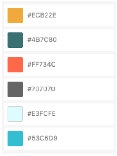
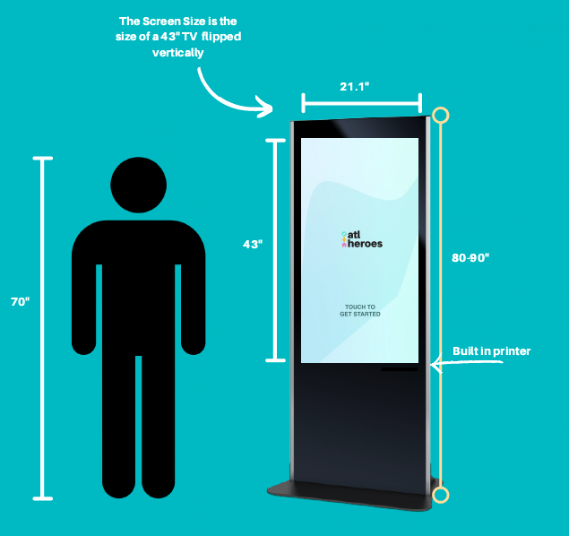
We planned to start out with a kiosk and work our way towards an app to allow mobility of our resources. If someone were to use our kiosk and then look for the app on their mobile device, the icon would be very recognizable as it has the same theme or colors and logo on it.
Blue has a calming effect to it as our main users may be in some distress. It also is used as a sign of trust. Orange and yellow is geared more towards the volunteers that use our software. These colors are motivational and are used to inspire our volunteers to do greatness. They also bring energy and optimism for both parties using the app. Lastly, the grey is for our text so that it is easily readable but not as harsh as black would be.
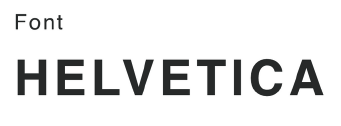
This font is deemed to be clear and easy to read for all types of people that will come across the kiosk.
Wireframes
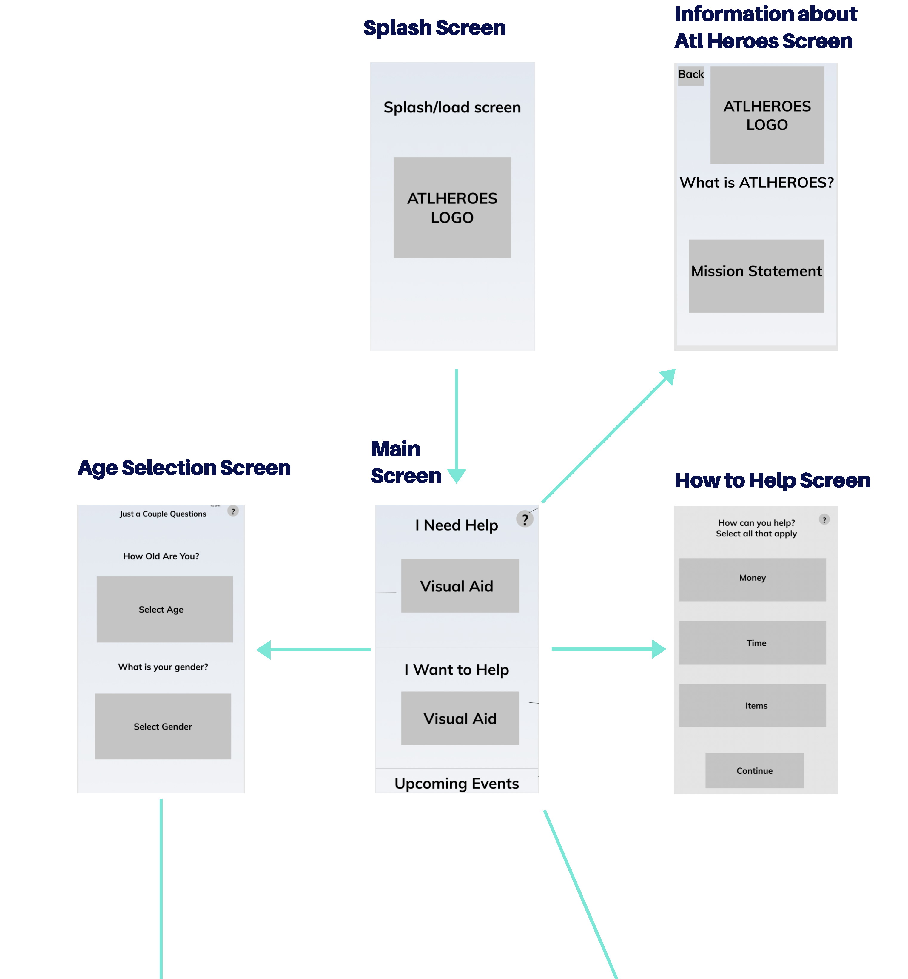
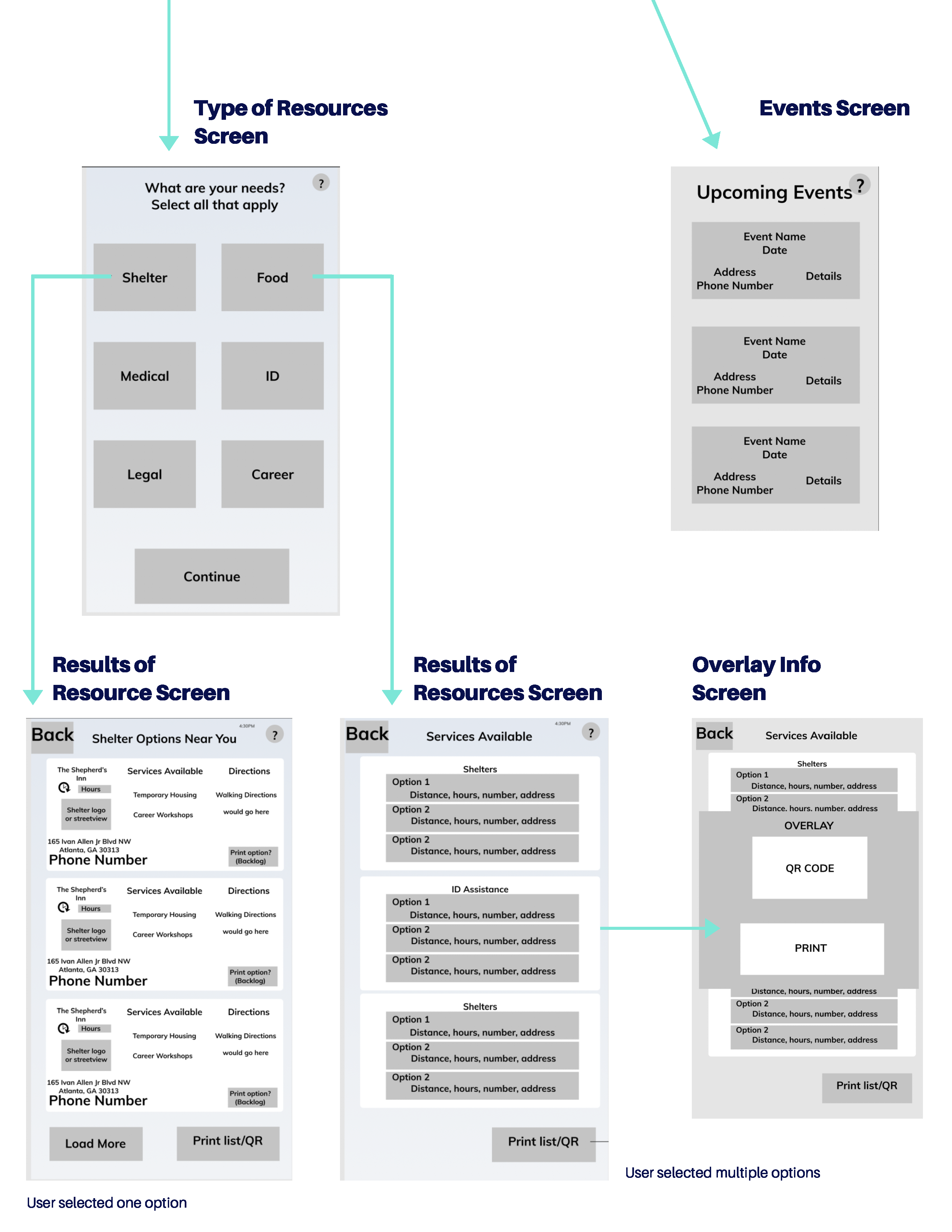
Many shelters and services are geared towards specific age/gender groups, so in order to provide accurate info, it is necessary to do a quick check
UI/UX Design
The objective of the interface was to keep the app easy to use, read, and navigate, and give a safe atmosphere. This was accomplished through the use of clean backgrounds, color contrasted texts, large font sizes, symbols and icons.
Interaction Design
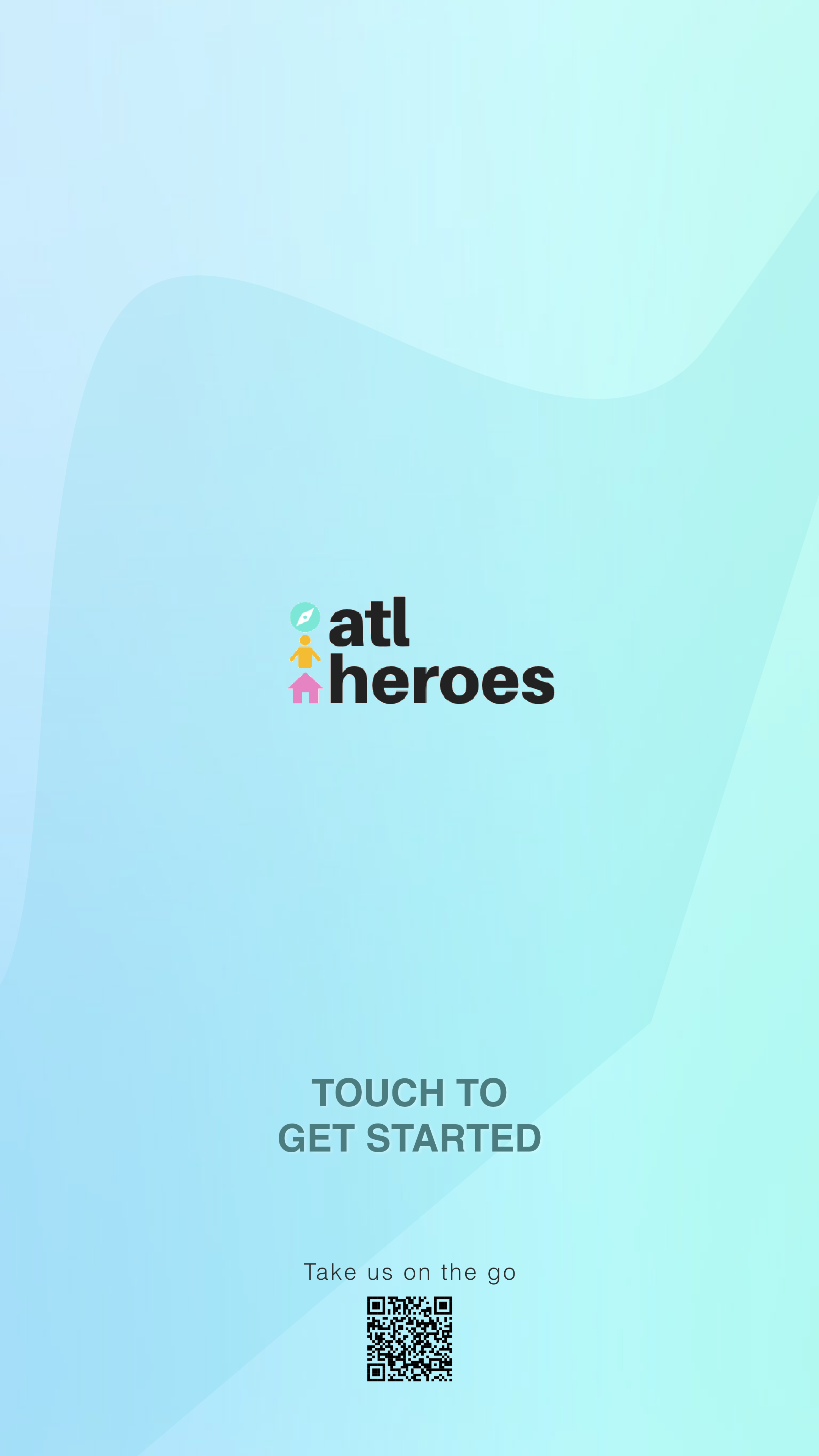
Start Screen
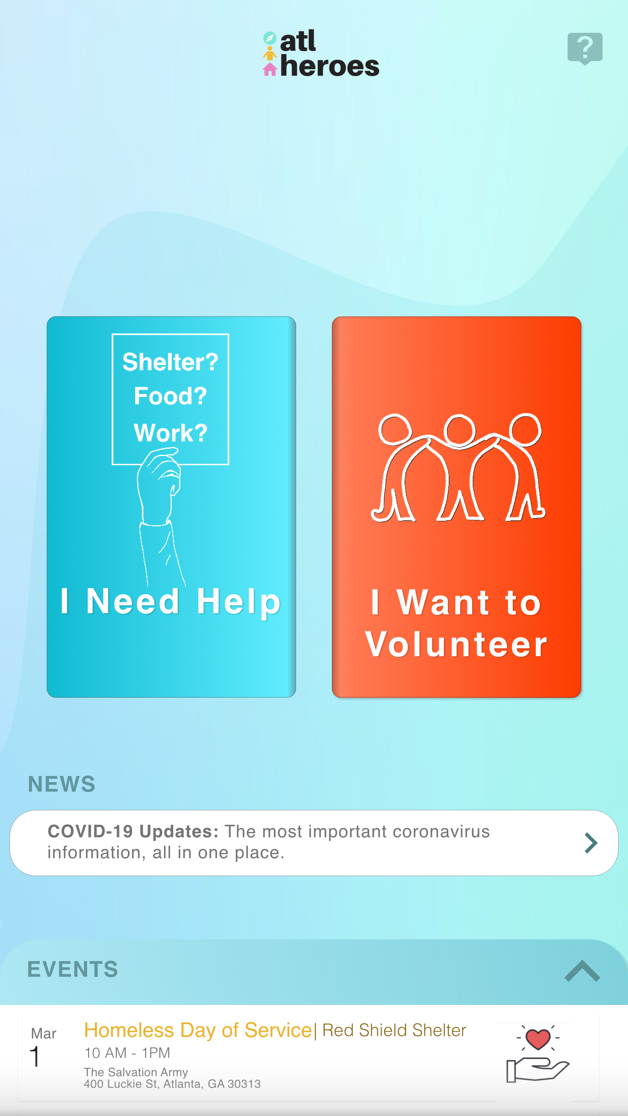
Home Screen
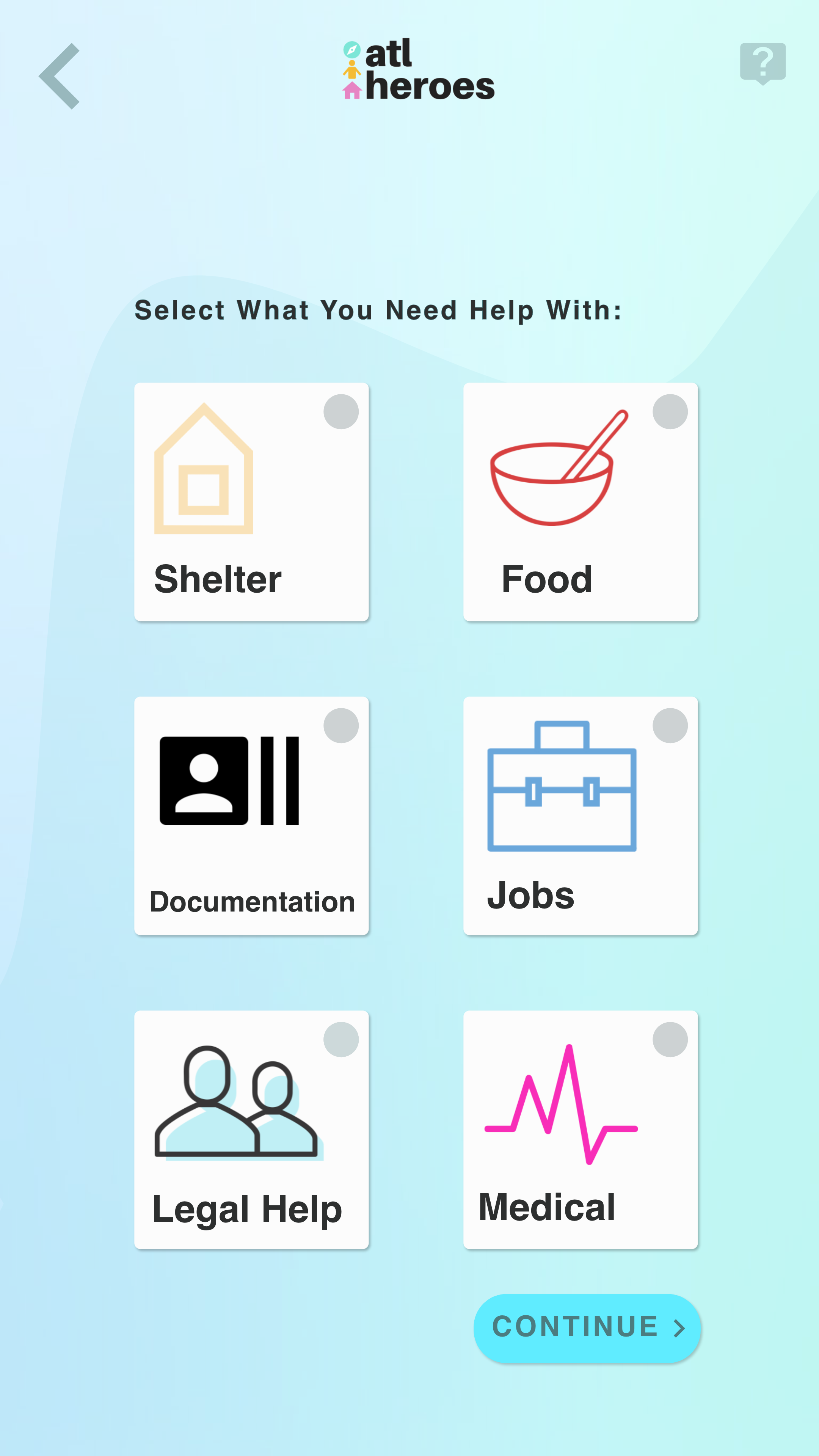
Types of Resources if User Needs Help
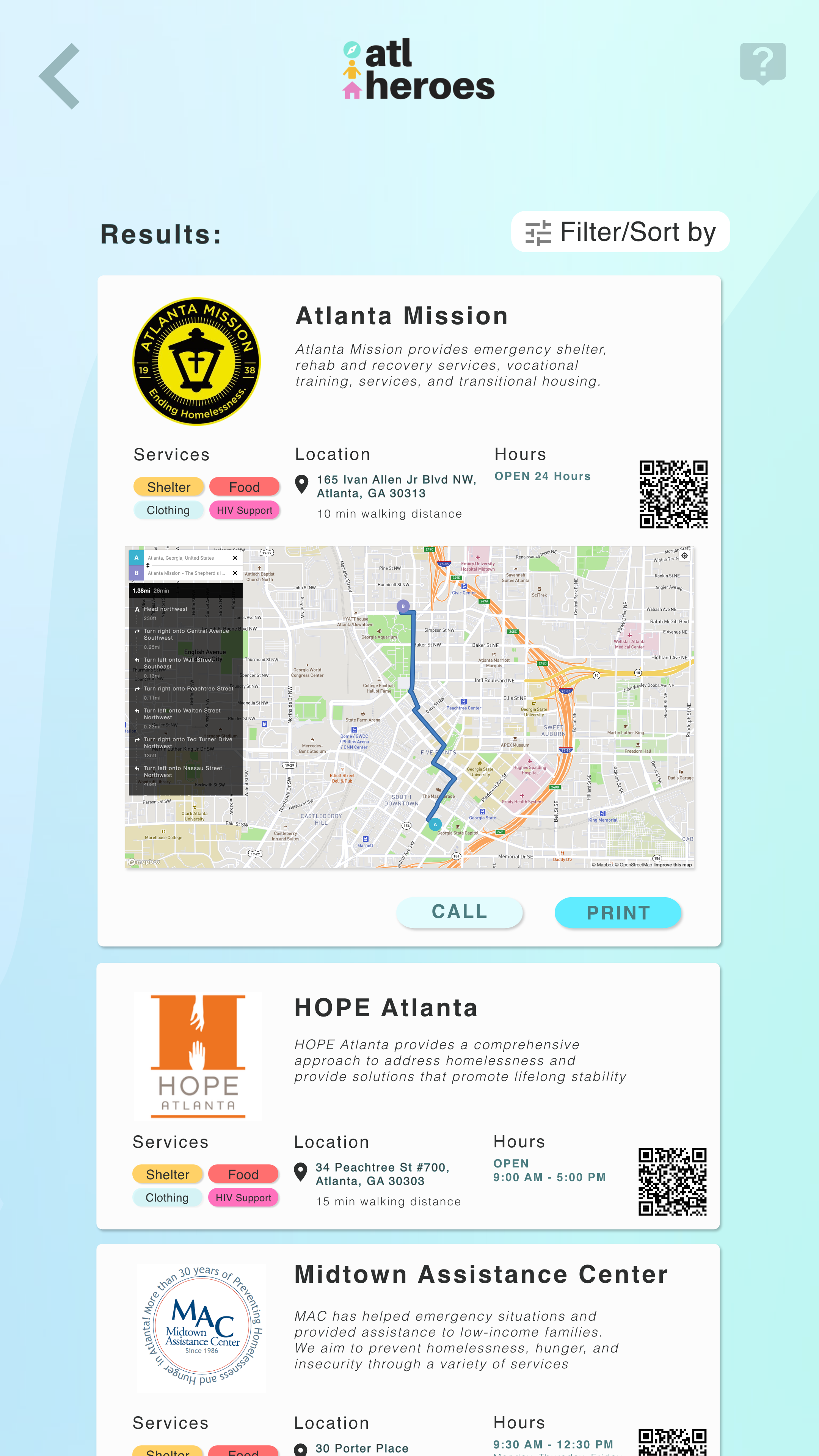
Results Shelters Available
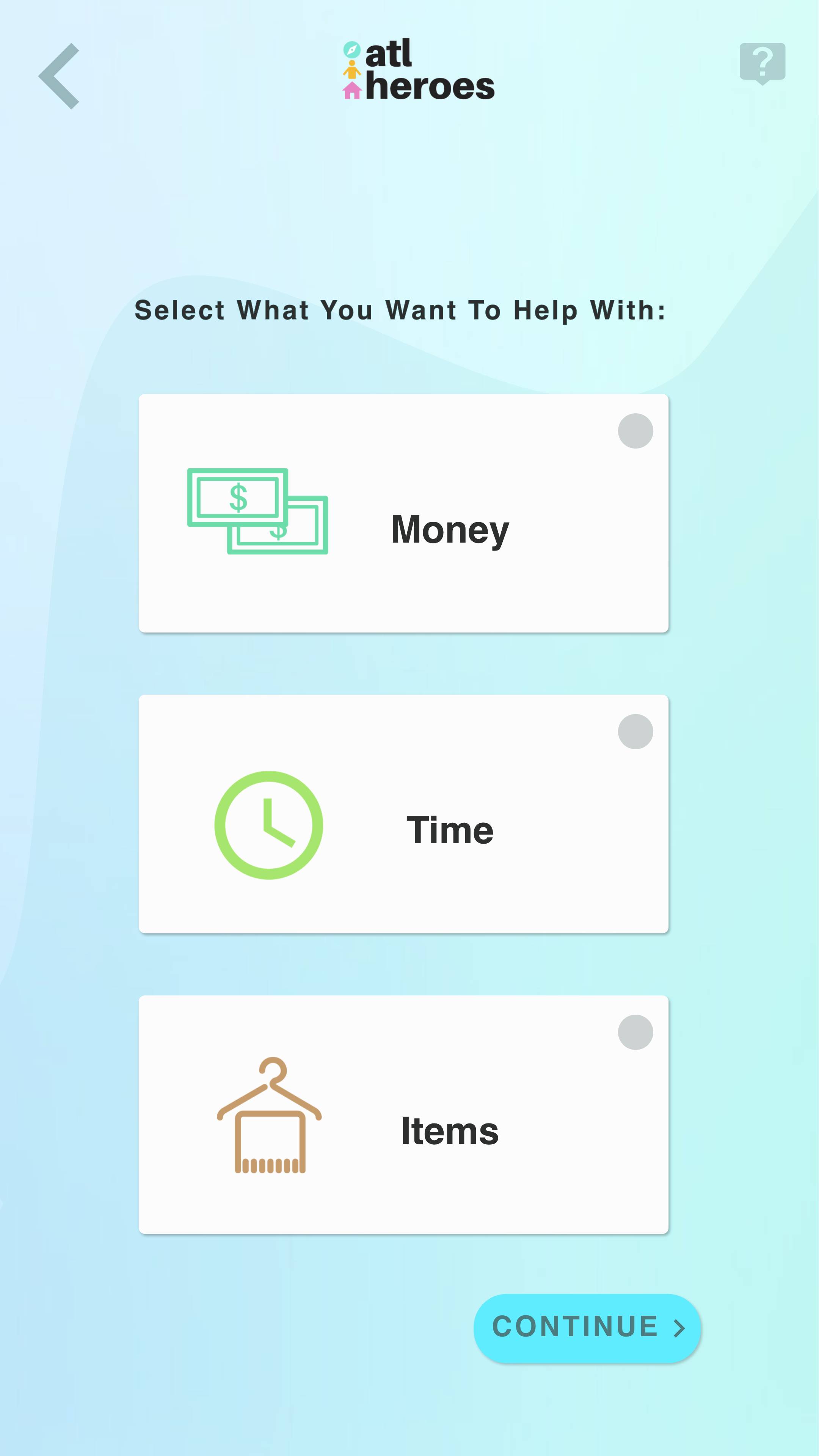
Types of Support if User Wants to Volunteer
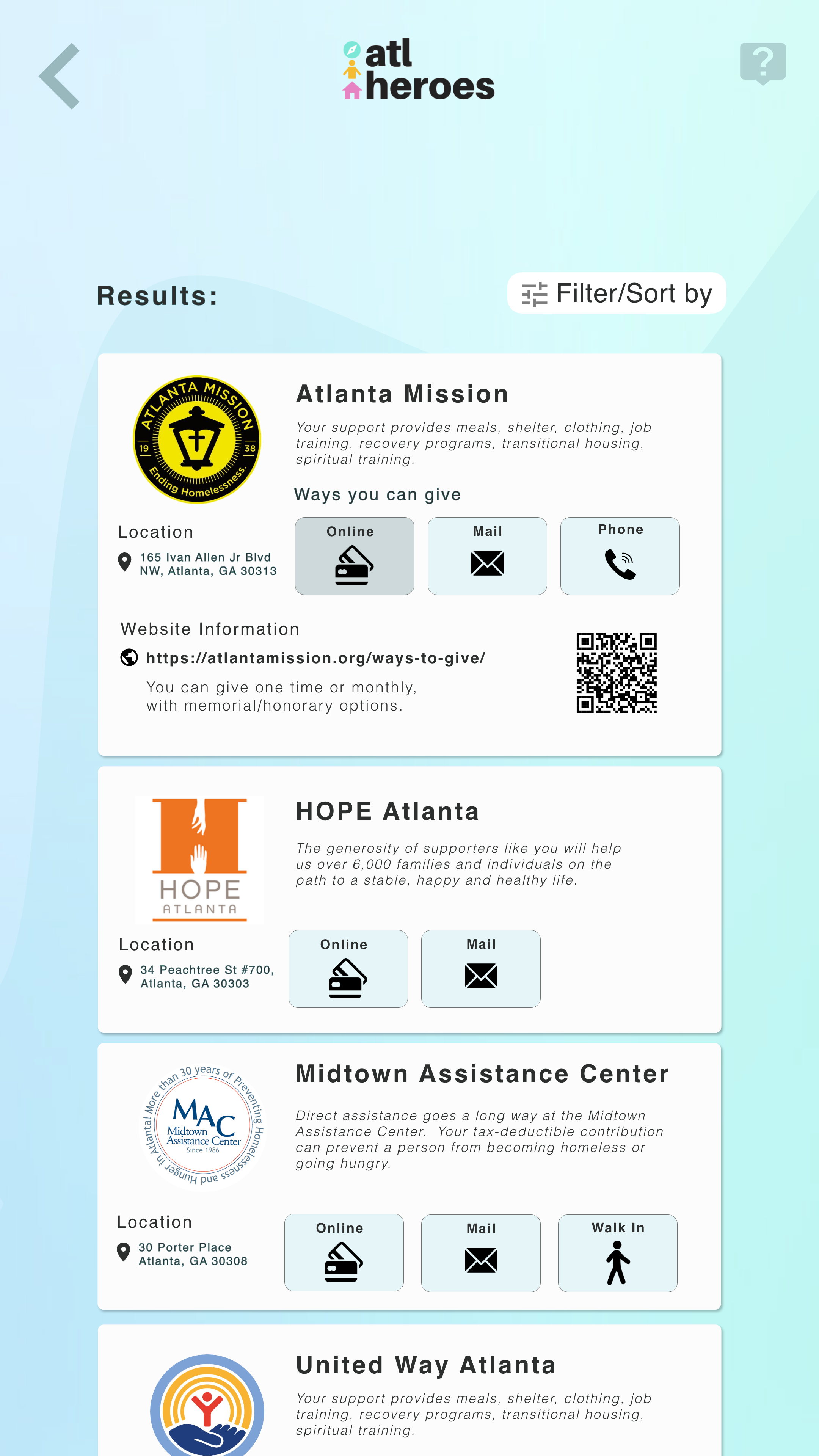
Results of Places to Donate Money
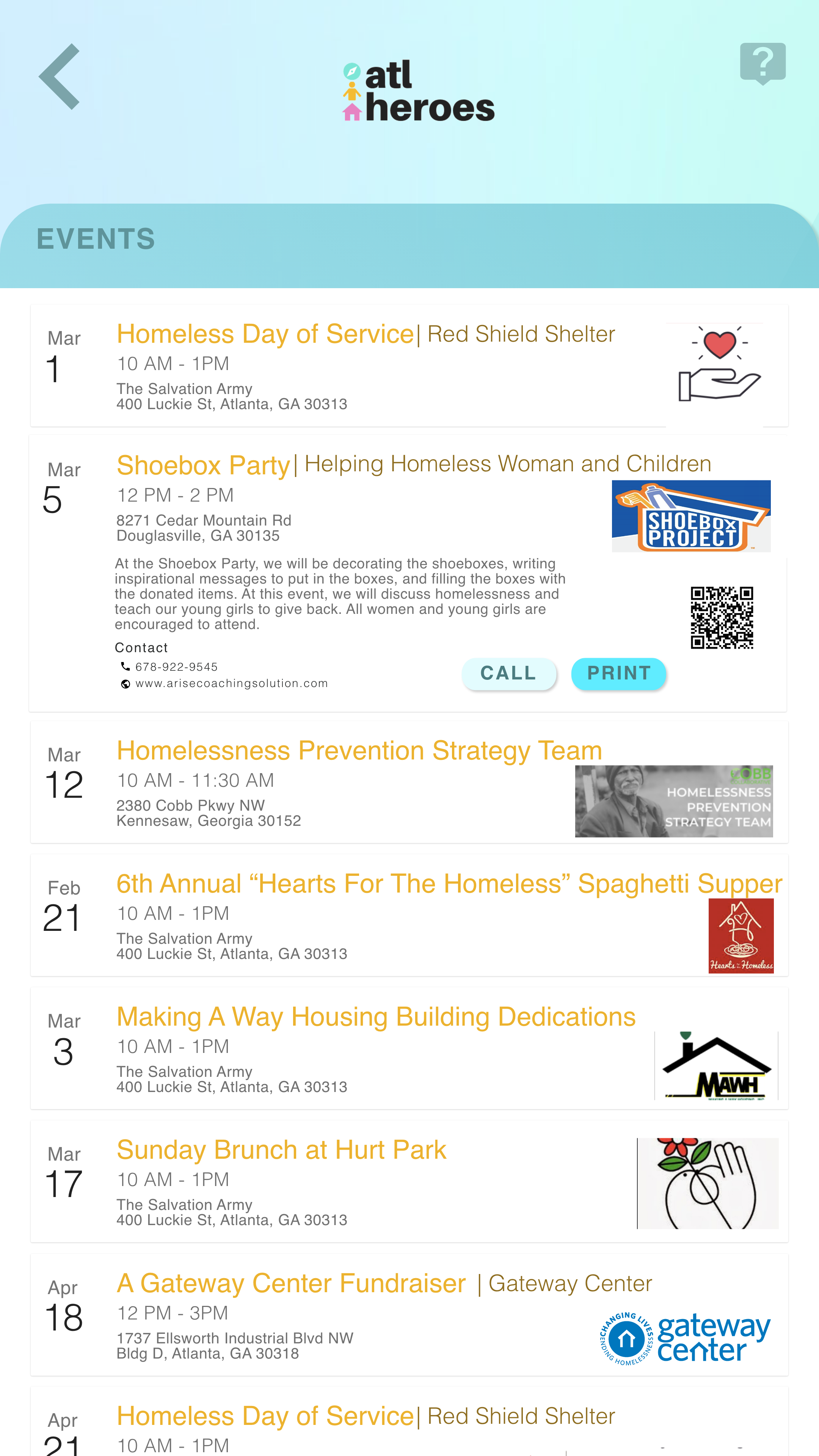
List of Events for Homeless and Volunteers to Be Involved
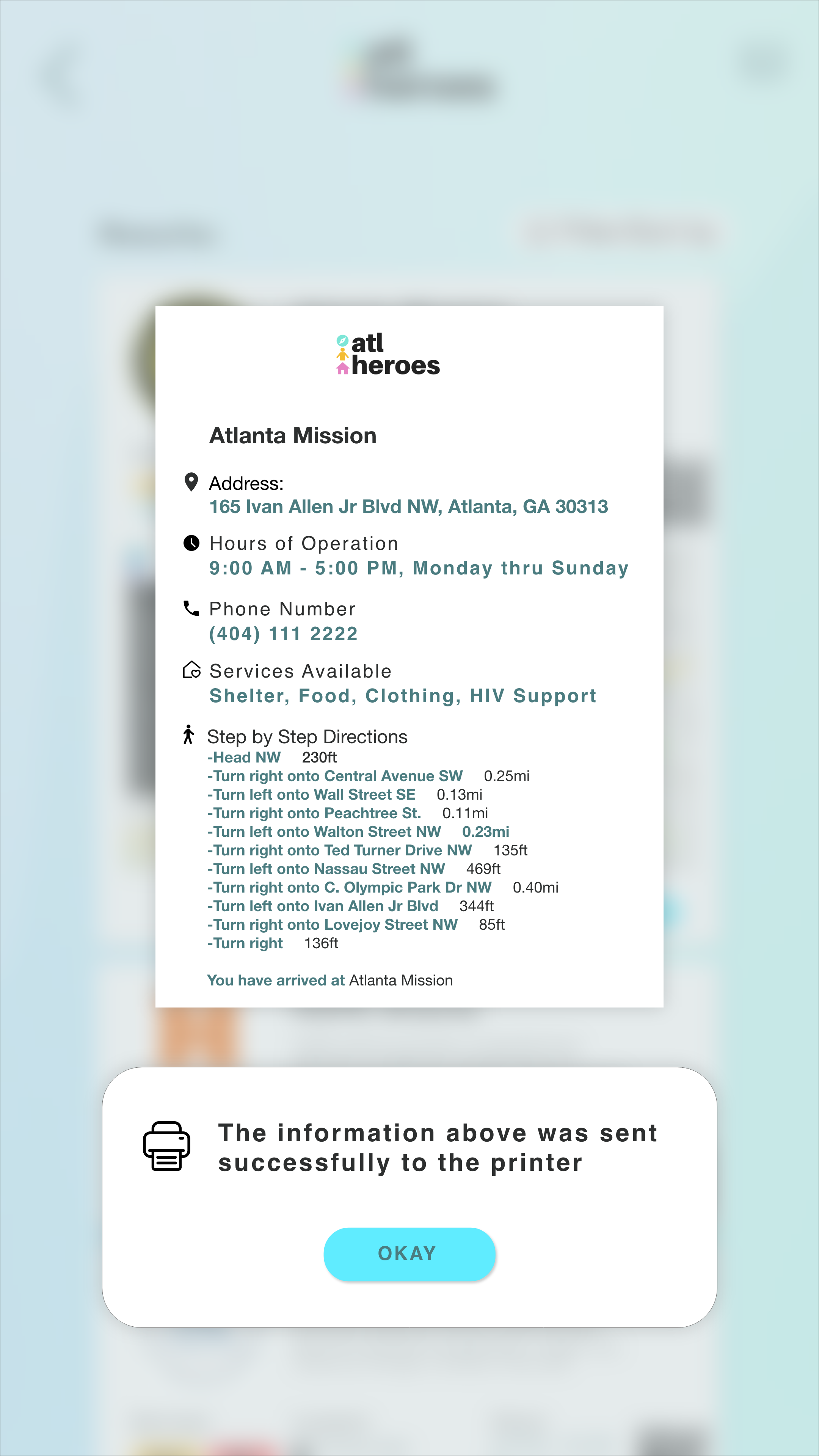
Printing Feature when User Requests to Print Information
Outcome
We conducted a usability testing plan to assess the effectiveness of the system, to identify areas of improvement, and areas of success. Our goal was to to gather enough information by testing our prototyped system to potential users who are interested in taking roles to different sets of scenarios related to homelessness. This process involves asking for help, volunteering services, and being involved with events in the community.
Our findings were collected from 10 participants. So far 60% of people are aware of local public services such as shelters, food banks, and non-profit while 40% of people know a few of those services.
We also found that the majority of users' experience with the system was friendly to use, and that they believe this system would be benefitial if they were to find in desperate need of resources.